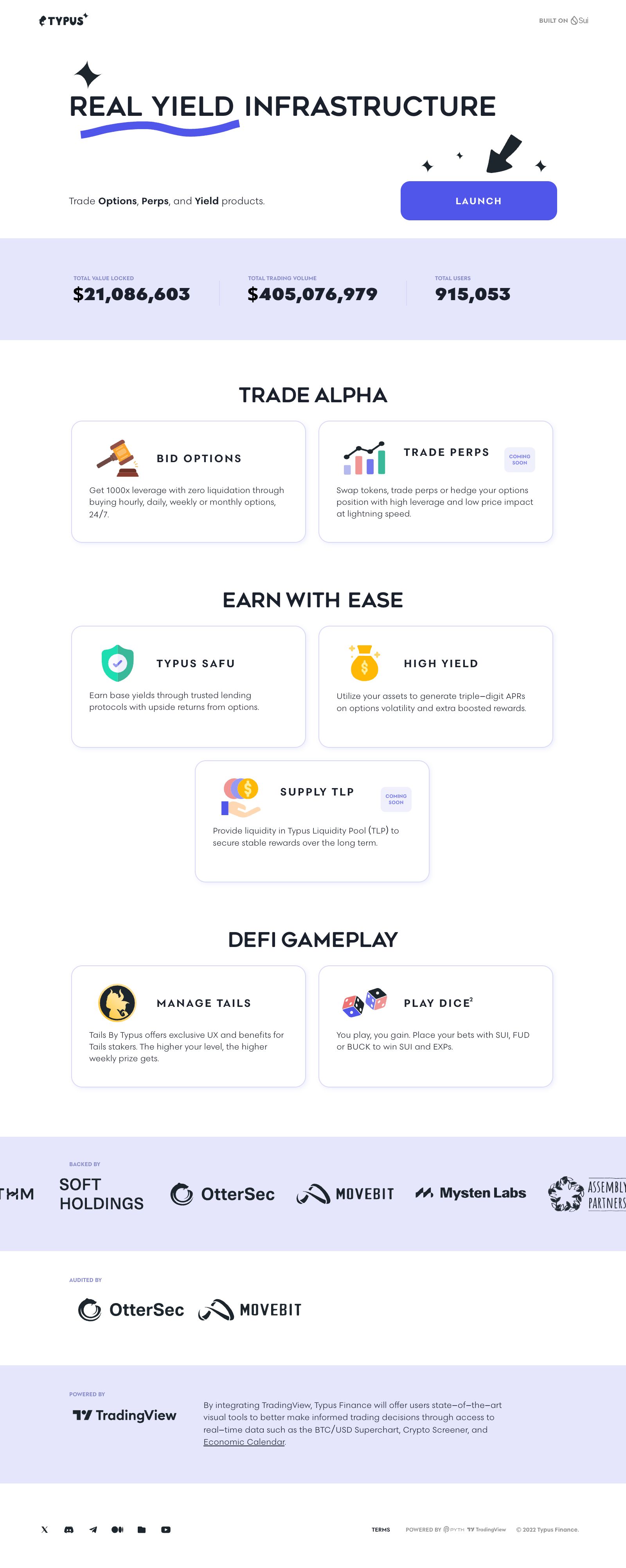
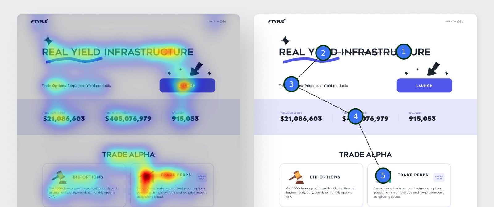
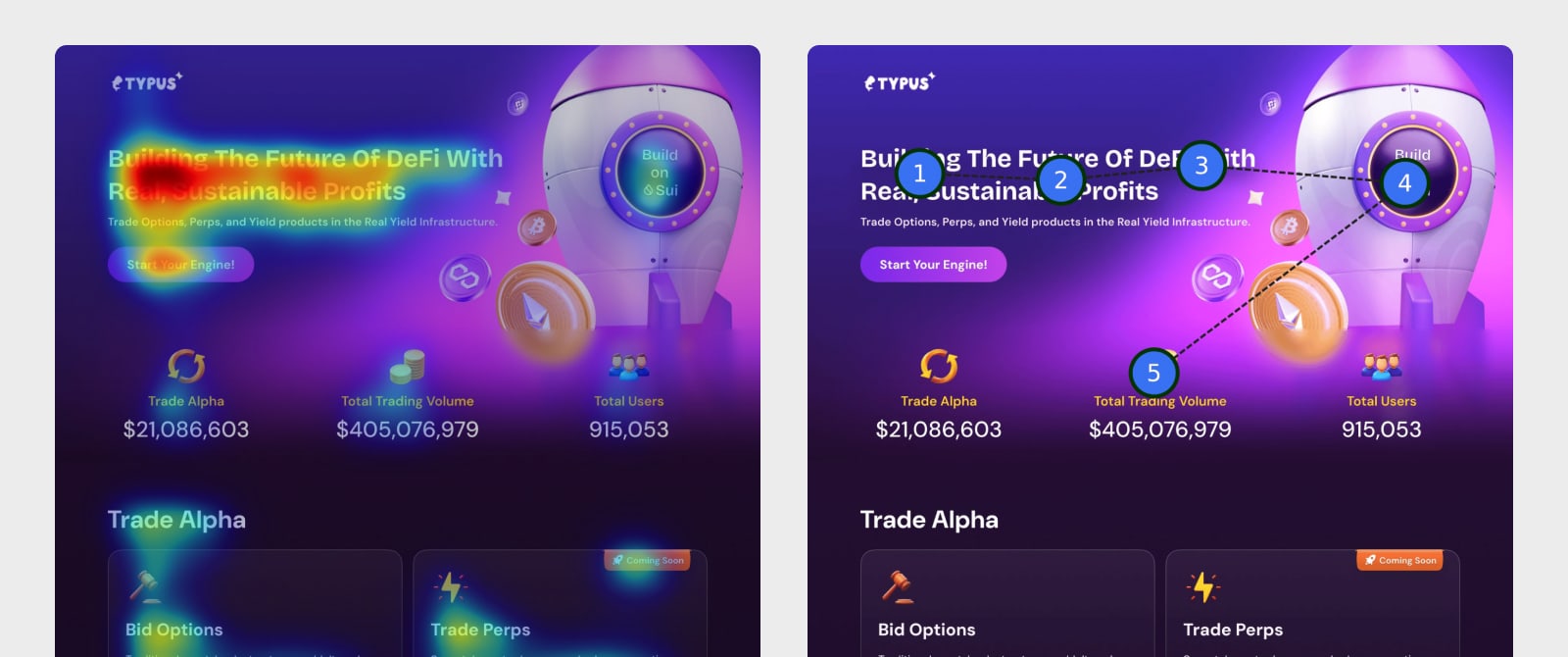
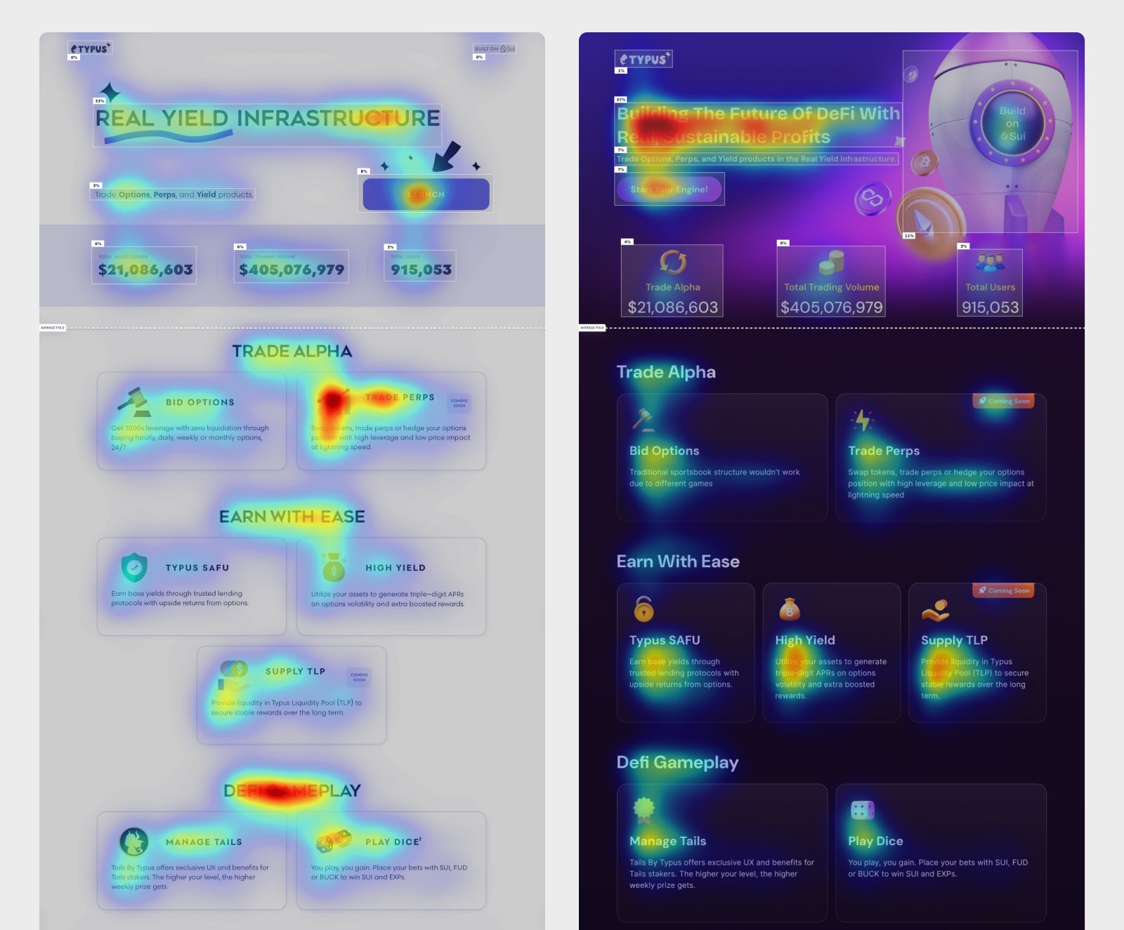
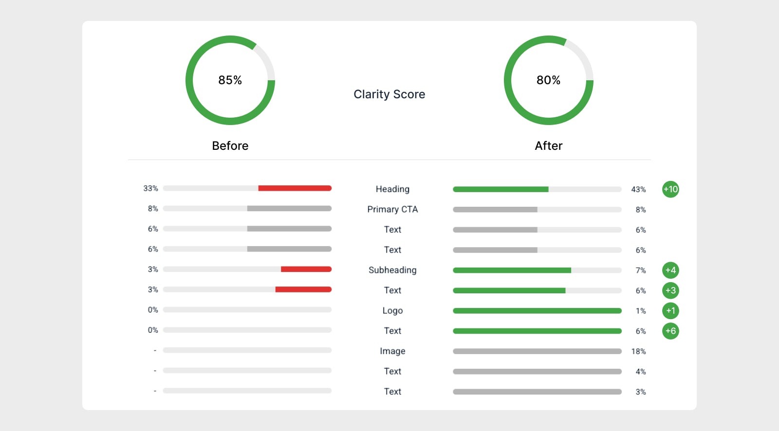
Designing for Action : A 2-Week Redesign That Drove 80% More Clicks

Landing Page Redesign
Client
Typus Finance
Role
Product Designer
Duration
2 Weeks

🔍 Project Overview

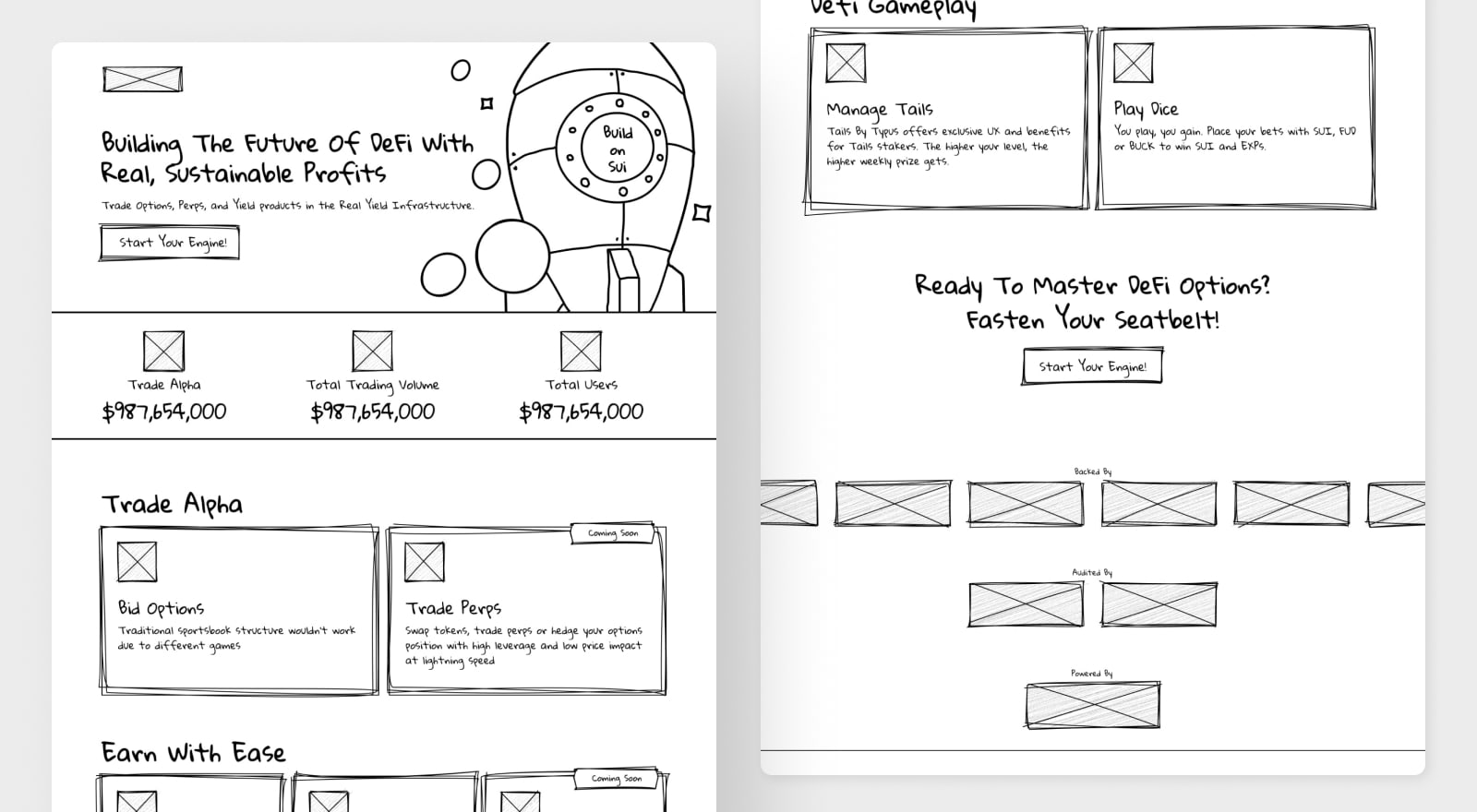
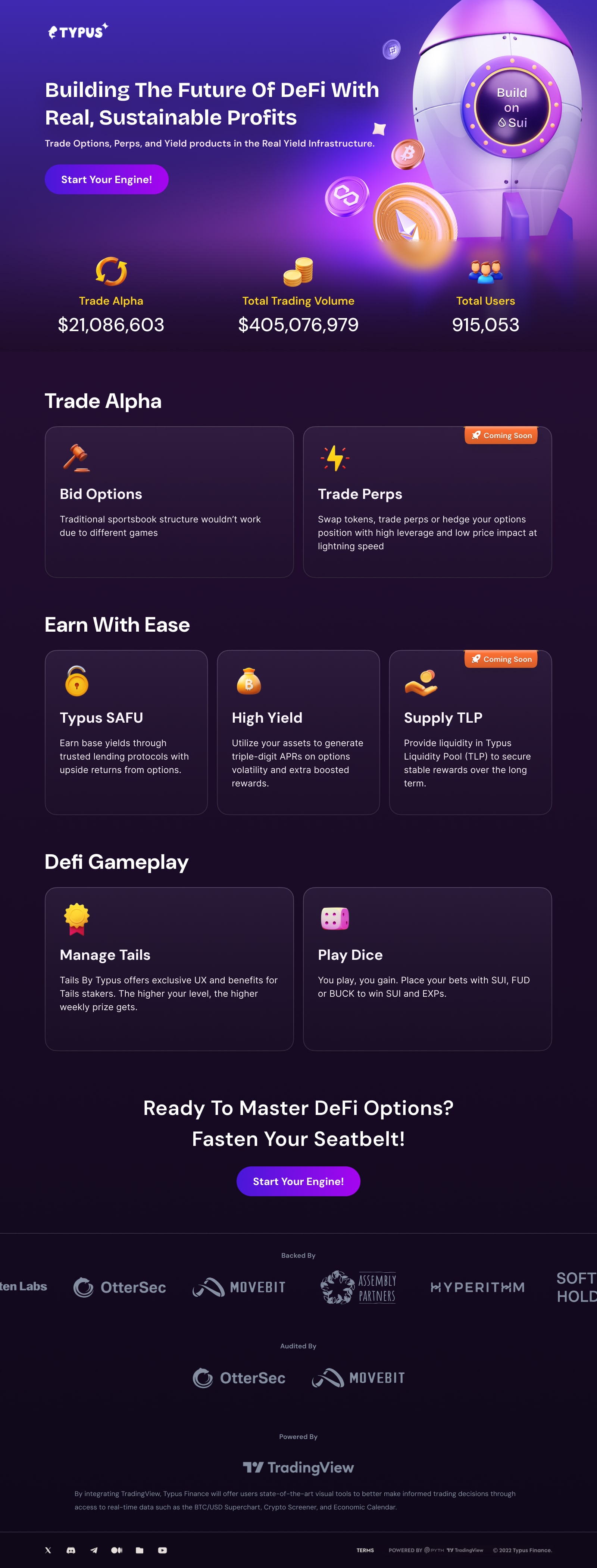
When we took over this project, the existing landing page was underperforming. Although it was rich in information, it failed to effectively guide users to click the CTA. As a result, incoming traffic was not successfully converting.

Current Design

🎯 Goals

  • Increase conversion rate
  • Enhance the brand’s professional image and quality perception

🧱 Challenges

  • Low Conversion Rate: Users had short session durations and a very low CTA click rate.
  • Unclear Visual Hierarchy: Users struggled to quickly identify the core value propositions.
  • Lack of Emotional Brand Connection: The overall visual tone lacked a sense of professionalism, making it hard to build user trust.
  • Poor Fit for DeFi Branding: The design used flat elements and colors that didn’t reflect the futuristic, high-tech nature expected from DeFi platforms.

💡 Solutions

  • Immersive Dark Mode Design
    Adopted a dark-themed interface to create an immersive experience. Key messages were emphasized, secondary elements subdued, and futuristic visuals + micro-interactions were added to capture the high-tech vibe of DeFi.
  • Improved Visual Hierarchy & Communication
    Key data like total transaction volume and total user count were visually elevated using contrast and placement, building greater user trust.
  • Clear Module Categorization
    We restructured the content hierarchy to make the primary modules — “Trading,” “Earnings,” and “DeFi Gamification” — more distinct and easier to digest, reducing cognitive overload.
  • Rewritten CTA Copy for Better Motivation
    The original CTA label, “Launch,” lacked specificity and emotional drive. We changed it to “Start Your Engine!”, aligning it with the rocket imagery in the hero visual to strengthen thematic cohesion and motivate action.

📊 Design Analysis

Heatmap & Eye-Tracking of Current Design

Redesigned Lo-Fi Wireframe

Redesigned Hi-Fi Mockup

Heatmap & Eye-Tracking of Redesign

Attention Map & Clarity Improvements

📊 Impact

The redesign resulted in significant improvements as verified by behavioral analysis (Heatmaps & Gazeplots):
  • The new design focuses on clarity, emotional engagement, and DeFi brand alignment.
  • The rocket-themed call to action created a stronger narrative moment and increased interaction intent.
Explore More
Rebound
Made for all those who are interested in sports betting or just simply enjoy sport talks
Web and Visual Design
96% of people pay attention to the visual design first when they visit a website